BDWM BBS
User Experience Design
2016-2018 Peking University BBS Development Group
Team: Yujie Zhang, Zhengkuan Yan, Weize Zhao, Qiqi zeng
My Role: User research, Interaction wireframe, Prototype
Mobile app design for an 18 years old student forum.
BDWM BBS ( 北大未名BBS ) is Peking University(PKU) official student online forum was born in 2000. It’s semi-internal and only accepts PKU students. While every year thousands of new students join in and are connected at this online forum, the classic web design didn’t quite keep up with trends and development. This student forum was designed for telnet, then for the web. And now it’s time to transform it into the mobile platform.
From 2016 to 2018, I’m responsible for the interaction design of a new mobile app. I worked with another designer and product manager to deliver interaction wireframes for UI designers.
We designed an app that bring classic campus Bulletin Board System(BBS) to mobile phone
Approached by Youth Research Center of Peking University, we were tasked with improving a classic students BBS to be more reliable and accessible in mobile era. Our solution was BDWM BBS, a native app that improve the reading and posting experience with new features integrated.
We did a good job
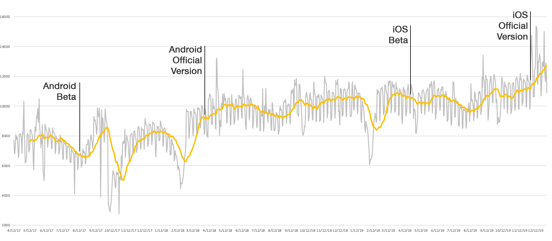
After the Android beta launch and official launch, The number of the average daily active users increased by 25%+. iOS beta launch and official launch brought another 25%+ increase. In general, daily active users grew from 8000+ to 12000+ and it is still growing.
Simple and smooth sign up process
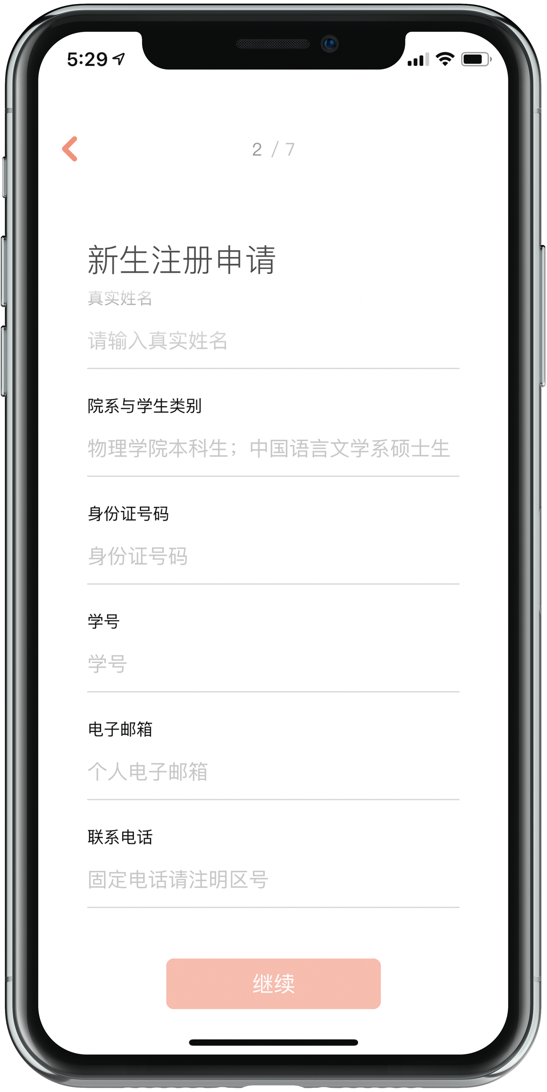
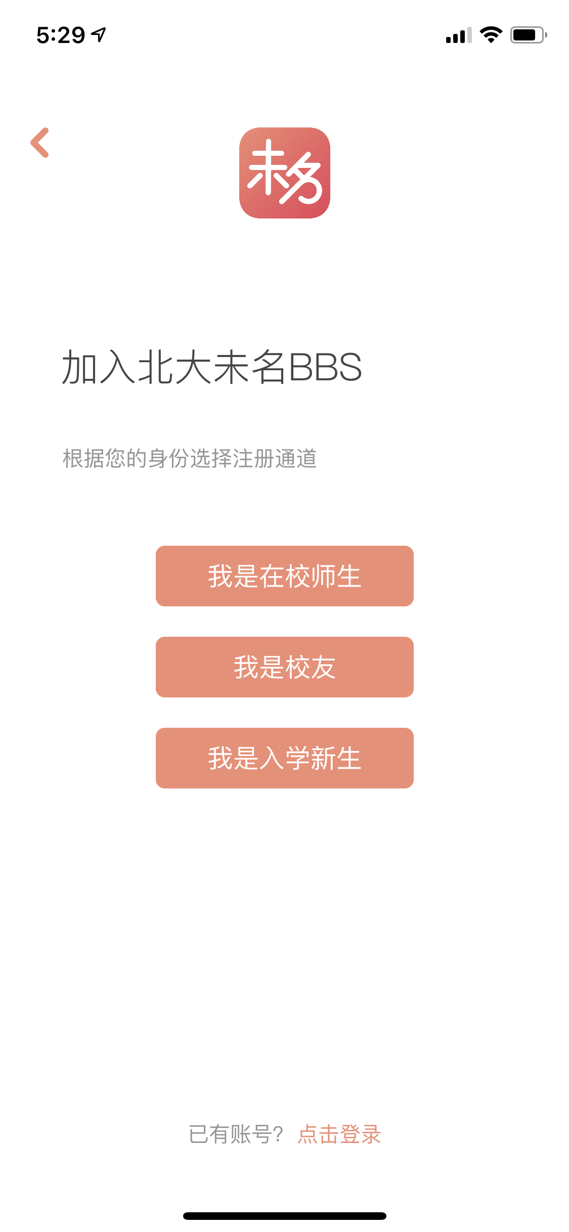
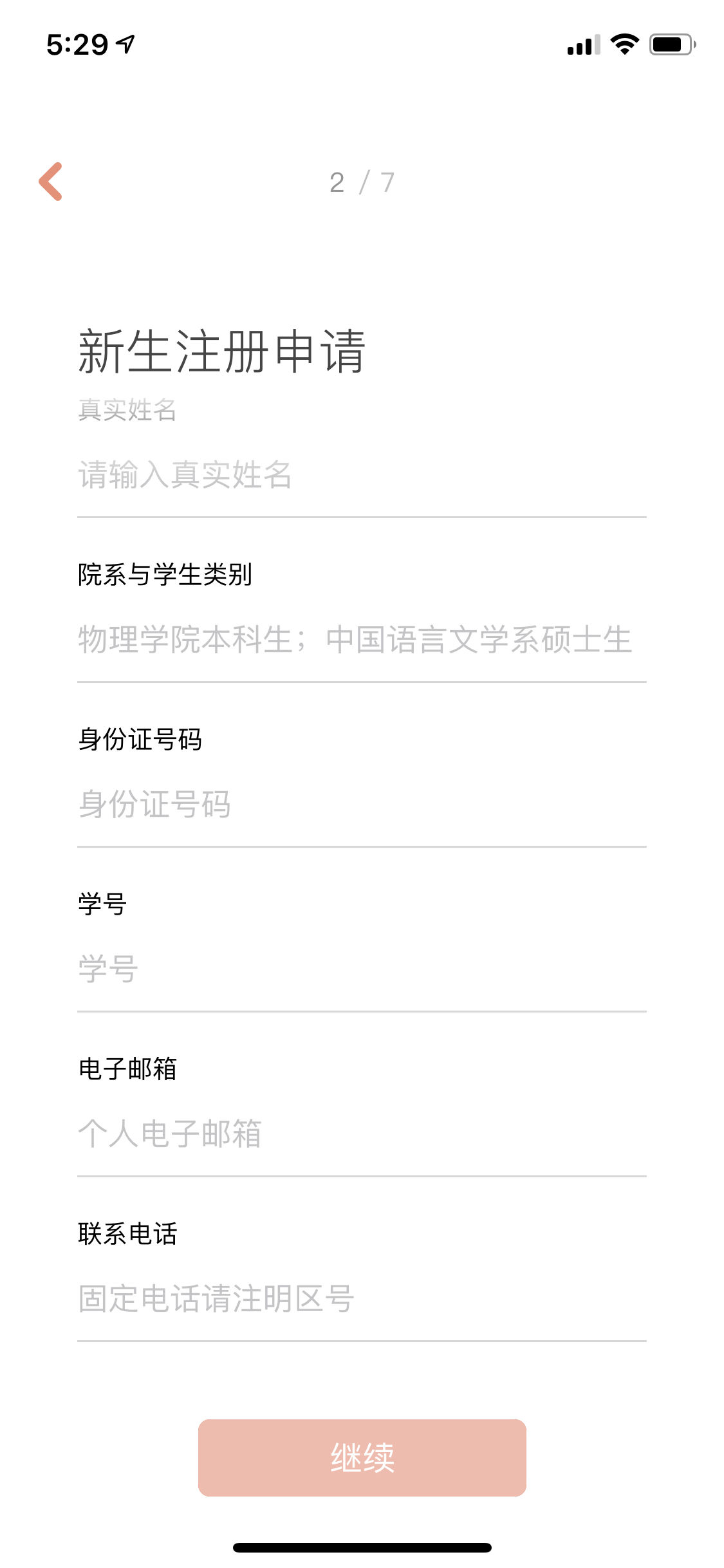
A valid user registration process to authenticate users is necessary for semi-internal BBS. The new sign up flow design focuses on the most common process. The new design makes it simple and smooth with clear call to action. Of course, we still keep the simplified classic sign up sheet for special event.
Left: New sign up flow
Right: Old style sign up sheet
New way to access hot news and your interests
Never miss popular discussion in BBS and live updates from your interested sections. The home page now has top discussions and official notice from school. At the same time, we add a new feature “news feed” which collects all the updates from your favorite sections. There is always news in BBS.
Left: News feed
Right: Home page
Clear hierarchy on both search and navigate display
New information hierarchy design for mobile. No matter which way you use to find your interests, by search or navigation, all the information you need are complete and distinct in your hands.
Left: Search flow
Right: Category
Coexistence of in-BBS mail and instant message
We bring both classic in-BBS mail and modern instant message to the mobile app. With the new design, old and new users can find their favorite way to get connected in here quickly and easily.
Left: In-BBS mail
Right: Instant Message
Design Process Overview ————————————————————————————————————————————————————————————————————————————
The challenge we were facing
The BDWM BSS has faced long term recession since 2009. As it didn’t keep its pace with the internet trend from the desktop web to the mobile web, DAU was declining rapidly year by year. In 2015, BBS launched a project to redesign the forum website including desktop sites and mobile sites. In July 2016, the DAU jumped back to 8000 but still far from optimistic.
New users (new students) and existing users (current students/professors/alumni) are more used to visit the forum through the mobile platform (mobile web, third party app) instead of the desktop platform. At the same time, we keep receiving the response like “I can’t find the app, where is the link?” when we introduced our forum.
To sum up what we observed:
Fewer people joined BBS when new students enroll
People visit BBS less in general, more user visit from third party app
The mobile web received many complaints
We understand our user and their habits quantitatively
To understand the needs and find design direction for BBS. We started our internal study based on back-end data to find out the answers for the first two questions:
Who is our user?
What are their usage habits?
The results unveiled some interesting clues and helped us understand more fully the context in which people use BBS.
User
BDWM BBS user group has three parts:
Student (new student/current student/alumni)
School staff (professor/facilities service staff/school officer)
Other (university union member)
Undoubtedly, students accounted for the vast majority of the active user. More than 90 percents are students. Around 8 percents are school staff and less than 1 percent are University Union members. The interesting clues are about the dynamic change of the user group. Every year active users left as students graduating and new users came as students enroll. Meanwhile, users from school staff remain unchanged.
Habits
Before we jump to user interviews and questionnaire surveys, there are two key insights we learn from our data.
Firstly, you might notice the periodicity of the daily active user number. It’s as easy to conclude users use BBS more frequently on weekday than weekend. There is always a steep increase from Sunday to Monday. We tried to find out the reason behind later in our following research.
The following insights are inherited from the previous user research conducted for the website redesign program. Combined with back-end data for cross verification, it clearly shows the users had various interested topics/sections in BBS but meanwhile some of the topics/sections are widely accepted. For example, “Top 10” is almost a must-visit section for all of the users.
Following with qualitative initial research
We had two weeks to explore and research the needs and expectations for the next step of BBS on campus. The process included collecting discussions on BBS and random interviews on campus. We asked questions like: How do you use BBS? How do you like it? How do you hate it? What do you want to improve? Add one function if you are designer.
These are some of our high-level findings:
They want a native app. We knew it.
People use BBS to kill time. Just like other social/news app, people visit them because they are bored. For students, attending class is boring. That’s why the number of weekday visits is much more than weekend visits.
The time they visit BBS is short and scattered. But exception occurs when there is a lively discussion or hot news.
People finished reading all the new content in a short time. Many complain about limited amounts of new information while actually, we know there is a lot.
People want clear and easy steps to find what they’re interested in. More than 900 sections in BBS people usually interested in less than 10 and change over time.
“A forum for college student didn’t have native app for smartphone in 2017. 😂😂😂” — from BBS
At the same time, we hear the complaints from students, alumni, and staff about the inconvenience of not having a native app. Some of them are using a third-party app which is just simply fetching data through BBS API. Those original comments are valuable but not instructive. Our team needs to find out what kind of app it needs to be for our forum to fit into the product line. Full function? Lite edition? Multiple version?
Modeling users via interviews and workshops
We conducted another interview research within the major user group from the perspective of the alternative mobile solution—the mobile website and third-party app. Doing the following research, we learn how our users think about current web design and synthesized the typical user stories as reference for design principles.
We also brought some wireframe sketches for people to play. These gave us some of the specific preference when people access BBS on their phone, and helped us understand more fully the context in which people spend their time browsing. As we went through the research, we noticed there are two kinds of users. We separated and named them as heavy user and light user. (Actually, there is another hidden group, I will talk about it later)
Heavy user: Participate actively in BBS discussion.
Light user: Use BBS as another twitter to browse news and kill time.
⬇︎Persona and their storyboard
Determine the goal
Combined with insights from data and user research, design targets and principles alongside the empirical instincts give us an instructive path to solve the challenge and create a new product for BDWM BBS. With the affinity diagram of research findings, we can narrow down the scope of the design direction we should follow. The decision we made was to build a mobile app for
Convenient hotspots and interests access with browse and communication function fully integrated
Understand and reshape information structure
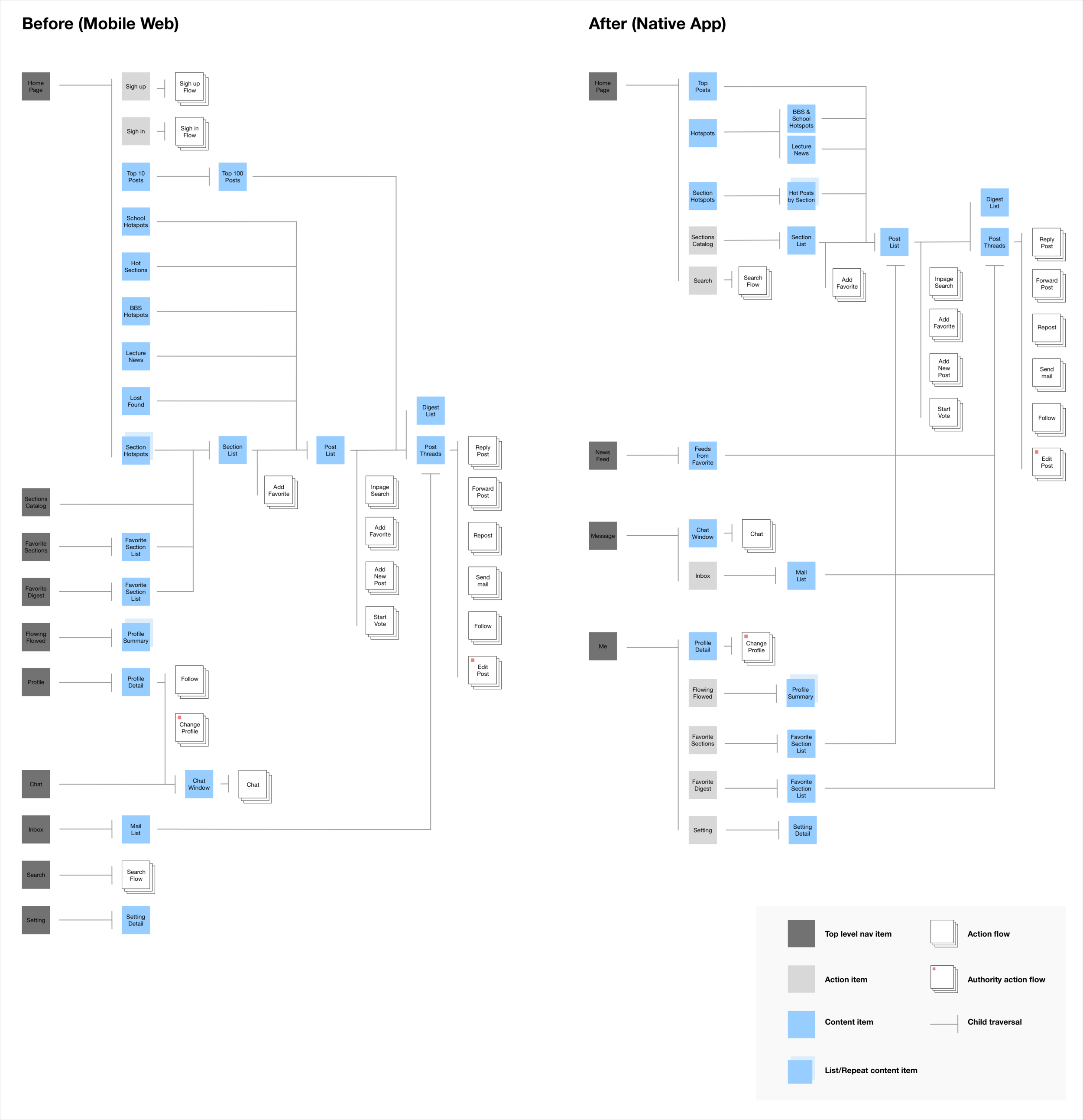
Before we start working on the wireframe, one of the largest portions of my work included re-organizing and simplifying the Information Architecture (IA) of the BBS, which had become cluttered with content and hierarchy all the time for the mobile user. IA also helped as a framework for the whole team to understand and discuss the underlying logic.
When all was said and done, we went from 10 top nav pages to 4. We reduced the breadth and increased the depth of hierarchical relations. And we put similar information sections under the same nav page “Home Page” and created new sections “News Feed” for customized post update feed. All the above make sure quick and convenient access for hotspots and interests. Some changes are also made on message and profile I will talk about them later in detail.
Interaction flow
As a UX designer in the project, my deliverables are interaction prototype and wireframe. The BDWM BBS didn’t have any specifications for deliverables in the design process. So we first created an interaction deliverables specification for our team.
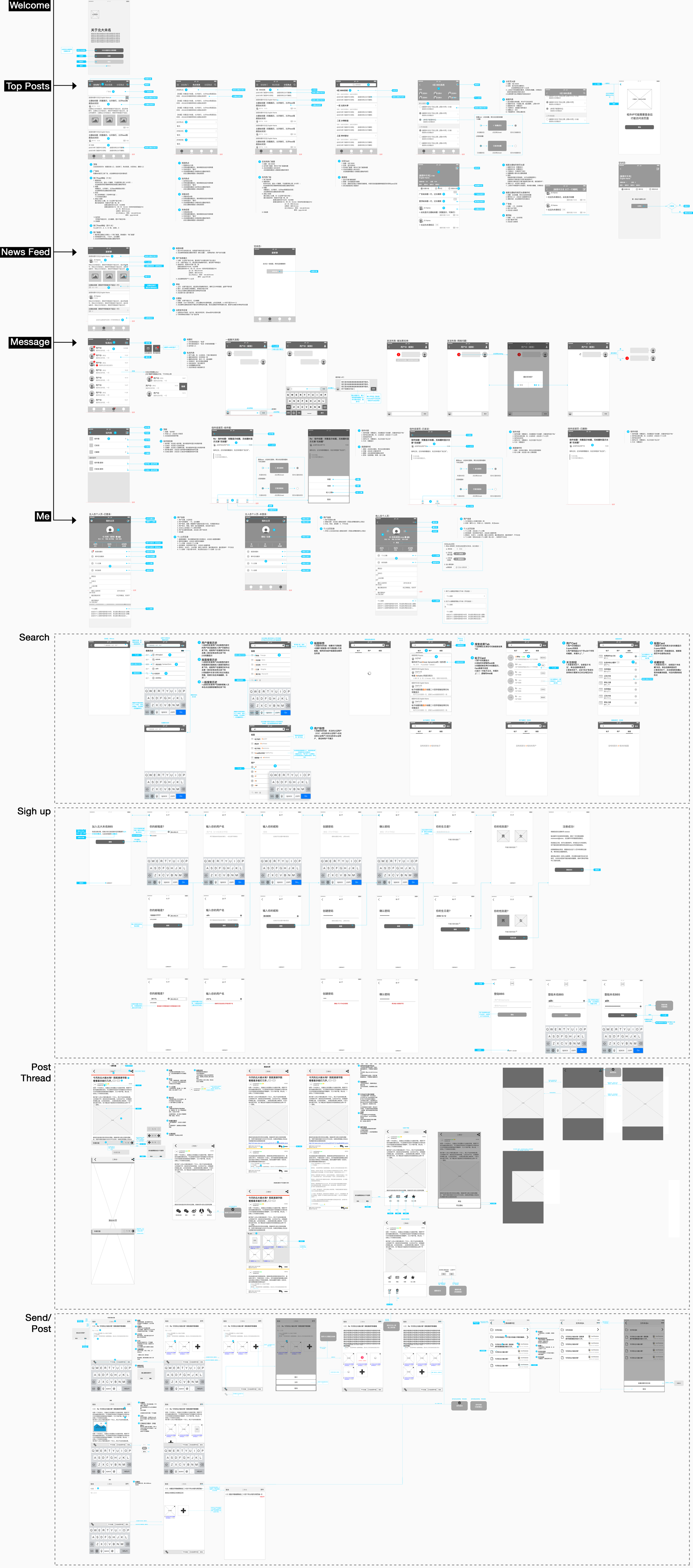
After these, we started to build our screen flows. All of the interaction design was done by me and Yujie Zhang. Every week we delivered new designs and iterated the previous design base on the feedback from the user test.
⬇︎Version 1.2.2 Screen flow wireframe
Some details we value
Sign up
I mentioned before there was a hidden user group we called “user without an account” who visit BBS through a tourist account (has restricted access level ). Those users, as well as new students, are fresh blood for BBS.
Previous sign up flow was a little bit scary at first glance for new users. There were too many Call-to-Action on one page. Although new users already knew this is a necessary process, this still holds them back.
As a semi-internal forum, a valid user registration process to authenticate users is necessary. A lot of information is required to fill out to prove you are a valid user. The new sign up flow design focuses on the most common process — using pku.edu email. The whole process is split into multiple steps. Each step only has one Call-to-Action. Of course, we still kept the old style sign up sheet which only for some edge cases.
⬆︎Special channel open exclusively for new students who don’t have pku.edu email every year. Those information needs manual review.
⬅︎ Previous sign up page
News Feed
On the BBS website, only Top 10 posts and Hot Sections are updated in real-time. Both of them are driven by the algorithm, not the user. Besides, people have diverse interests. But the only way for the user to browse new posts in their interested section is to click through all the categories and repeat if they want to move to the next one.
The News Feed section in the app provides real-time update feeds for each user base on their favorite collection. The news feed can come from favorite sections and following the user. Each feed card gives user holistic preview for host post, reply post, section, and publisher.
Home Page
Learning from our user, the home page now becomes the home for all of the hot news/posts/sections/official notifications. All of them are a must-read for most of the users.
We divide all information into three parts: top posts, hotspots notification, and hotspots in section. User can switch between by simply swiping. Sections category and search are placed at the top corner for easy access by tapping.
Information Hierarchy
The user journey from navigating through section category and post list to read post threads is complicated. Users have to face a lot of information from the different hierarchy.
We want to create intuitive navigation experience by creating a clear information level, both visually and logically.
Search
BDWM BBS has a precise ID system for the user, post, and sections. Everything has its unique alphabet or numeric id. People use id to search what they want chiefly. Meanwhile, BBS also provide search function base on character matching.
The search function on the app has two statuses: preview and result.
Due to the limitation of our BBS server, the search result might take a couple of seconds to complete. The preview can provide a quick look for the top 5 results of each category so the user doesn’t need to wait too long.
Result
The app was very successful. After the Android beta launch and official launch, The number of the average daily active user (DAU) increased by 25%+. iOS beta launch and official launch brought another 25%+ increase. In general, DAU grew from 8000+ to 12000+ and it is still growing.


