Implicit Space Project Brief
Implicit Space uses virtual reality(VR) to explore private augmented reality(AR) interaction design in public. This project presents examples of AR content that meets social etiquette and uses body motions to categorize and visualize how other people recognize our space usage in public. And create a prototype of evaluation tool to help designer design for augmented reality base on proxemics research. This set of design tool and guidelines build courteous communication between individuals and helps avoid space conflict.
The full design research process includes Design Guide and Thesis Paper.
Full Design Research Process ————————————————————————————————————————————————————————————————————————————
Self-centered augmented reality
When we think about today’s augmented reality/mixed reality experience, there are always people hold a phone in front of their faces and look through the screen. For me, this is a very self-centered design, because the interactions are so focused on their tiny screen but the motions it causes don’t care about the world around the user (the only notification is “be mind around your surrounding”).
It raises a question for me:
How will these self-centered AR interactions reform people’s relationships in public?
This initial question becomes a start point for my thesis project. Following a series of prototype through different media, this project wanders in multiple design explorations for future AR design. Eventually, come up with a set of design guidelines for future AR designers.
Scenes from Hololens 2 Ads
We disturb others when we use AR — and vice versa
The first observation that Implicit space has is the Pokemon Go-like phenomenon. If you want to catch a specific monster you have to be in a specific place and hold your phone to find and interact with the digital monster. Once there are many people in the same place, you might block other’s views or be hit by other people when all of you are so focus to interact on screen. In this case AR creates a new conflict between people that never happen before.
This phenomenon can be more and more common as mobile AR experience be widely accepted because of the popularity of AR devices like Hololens and development kits like ARkit. How far will this phenomenon go? What kind of interaction study we are missing for that? And how to design new AR experience to avoid these impacts?
Screenshot from Youtube of Pokemon GO central park chaos in NYC
What do impacts look like when we interact with virtual objects via screen?
The comment from initial expert interviews “Space is a resource that every motion will take it less or more” lead me to develop the first prototype test, in which people use their hands to measure the size of a book cover that can transit between real-world and screen through the camera. This prototype is meant to challenge how people ignore space intrusion when they use different body gestures to interact with augmented items on the screen. With this exercise, user will have a chance to try some extreme gestures of playing with hand gestures.
From this prototype test, some insights are summarized by observing testees’ behaviors. For instance, the testees use the size of the augmented item (book cover) on the screen as a basic unit to change their gesture or they oscillate between using length and area to measure. All of these insights help me create a set of technical drawing that reflects space impact in current self-centered AR.
This series of drawings indicate the various possibilities of gestures create space impacts (green geometry) base on the same AR content (dot square). What is that mean to augmented reality? What if those space impacts do have physical effects.
I start with a quick prototype by making an accessory that user can measure the size of the plane they create for start an AR experience. As the accessory is a physical frame it can always show the space these motions temporarily occupied. But it is not enough.
So I decide to further explore the idea “concretize space impact” in a VR demo. Some effects that I choose randomly demonstrate potential interactions between different parts of the body and augmented objects. The extended volumetric space of body and sightline limited and bring objects to the ground. The hand has extended coverage areas to move objects. Comparing to the real actions (top right corner), the area of effects from real actions is much larger. But by intermingling these effects, the questions like how do you find out precise effects to describe impacts, what are impacts really is will arise.
Left: Body(red box), sight line(blue box) and hand motions(hand model) have different effects on augmented objects (green cube)
Right: In addition to same effects, hand motions have delayed effects along the track (white frame)
Proxemics study — the social code behind our motions
So far all the prototypes are base on the same scenario: A single person in public space. What if there are two or more people? Additionally, all the prototype above only explore from first-person perspective but nothing about external perspective which is my original focus point, the other people. Therefore, Implicit Space starts another thread on proxemic behavior (the use of space) on interpersonal communication.
Invented by Edward T. Hall in 1963, Proxemics is the study of human use of space and the effects that population density has on behavior, communication, and social interaction. Proxemics is one among several subcategories in the study of nonverbal communication, including haptics (touch), kinesics (body motion), vocalics (paralanguage), and chronemics (structure of time). —Wiki
In the real world, everyone follows certain common social codes to maintain social etiquette. We can expect how our behavior will affect other people and adapt it to minimize impact and vice versa. Most of them are beyond description as they rely on the understanding of body gestures and motions.
To explore the hidden rule behind interpersonal communication, I made a performance simulation in a dark room and use led light and infrared camera to examine how people behave under different interpersonal social situations. The insights that inspired me with the concept of implicit space between people.
1. Interpersonal communication case study: greeting
2. Case study in different scenarios
Made from a chart depicting Edward T. Hall's interpersonal distances of man.
Prototype in VR: how others learn our intentions from hand to whole body motion
Space impact comes from other people’s understanding of our motions in public. For example, when you try to walk through a crowd, people read what you want from your gestures and motions and will step back to leave some space for you to pass. In this case, your walking action generates an implicit space in front of you that tells other people how are you going to use that space potentially. Same to your motions from other parts.
In the first prototype, I develop an algorithm to visualize the implicit space generate by hand motions. While user is doing whatever they want in the prototype, white cubes appear to present implicit space based on other’s understanding.
Base on the previous prototype, the second iteration prototype is designed more like an implicit space visualization tool for designer. Designer can invite user to test their AR app with this prototype system. The prototype uses various color volumetric space and duration of them to demonstrate the implicit space that generated when user uses an AR app. As implicit space intertwine, interchange and constant change, designer can have a quantitative analysis of what kind of space impact their AR design will have. (i.e. to know if their AR design considered the impact on others)
To verify this idea, I set up a user test stage on the WIP exhibition in ArtCenter. Up to two people can join the stage simultaneously as “user”, other people as “designer” can see the result on the screen. Insights emerged from “user’s” and “designer’s” feedbacks.
One of the feedbacks from designer is impressive: “What if AR user interface can adapt itself to those space?”
Left: Introduction of user test stage
Right: User test stage installation.
Adaptive AR design concepts based on implicit meaning of our motions
Inspired by the feedback, I start to introduce implicit space as a dynamic stage for AR design. Like the screen as media for mobile app, body motions can imply different available space that can be the stages for different AR interactions or content.
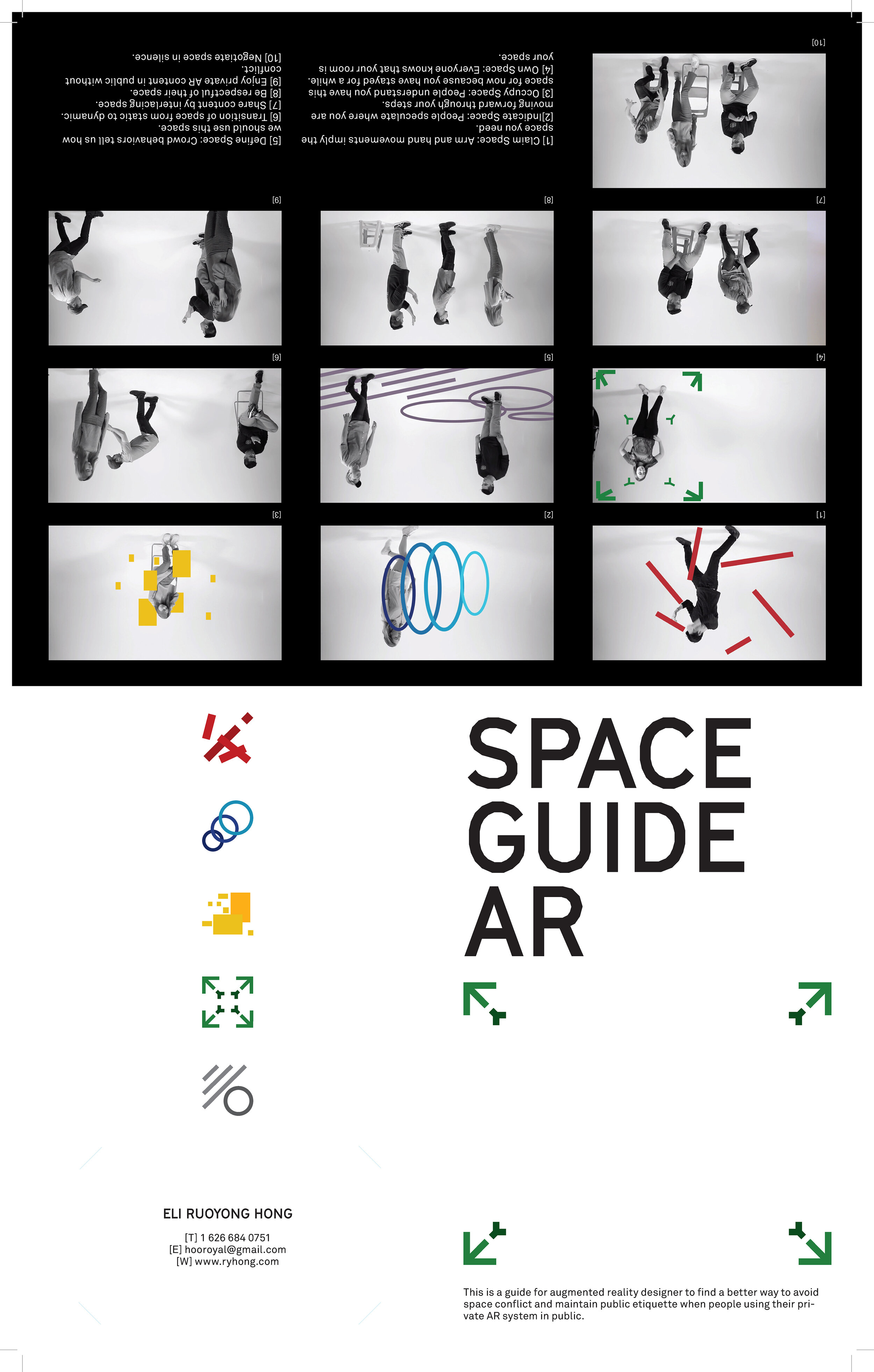
After a brainstorm workshop base on the insights from the proxemics study. We narrow motion implications down to 4 basic types as the common understanding for everyone that meet social etiquette.
Claim (limb)
Indicate (trunk dynamic)
Occupy (beingness)
Own (monopoly)
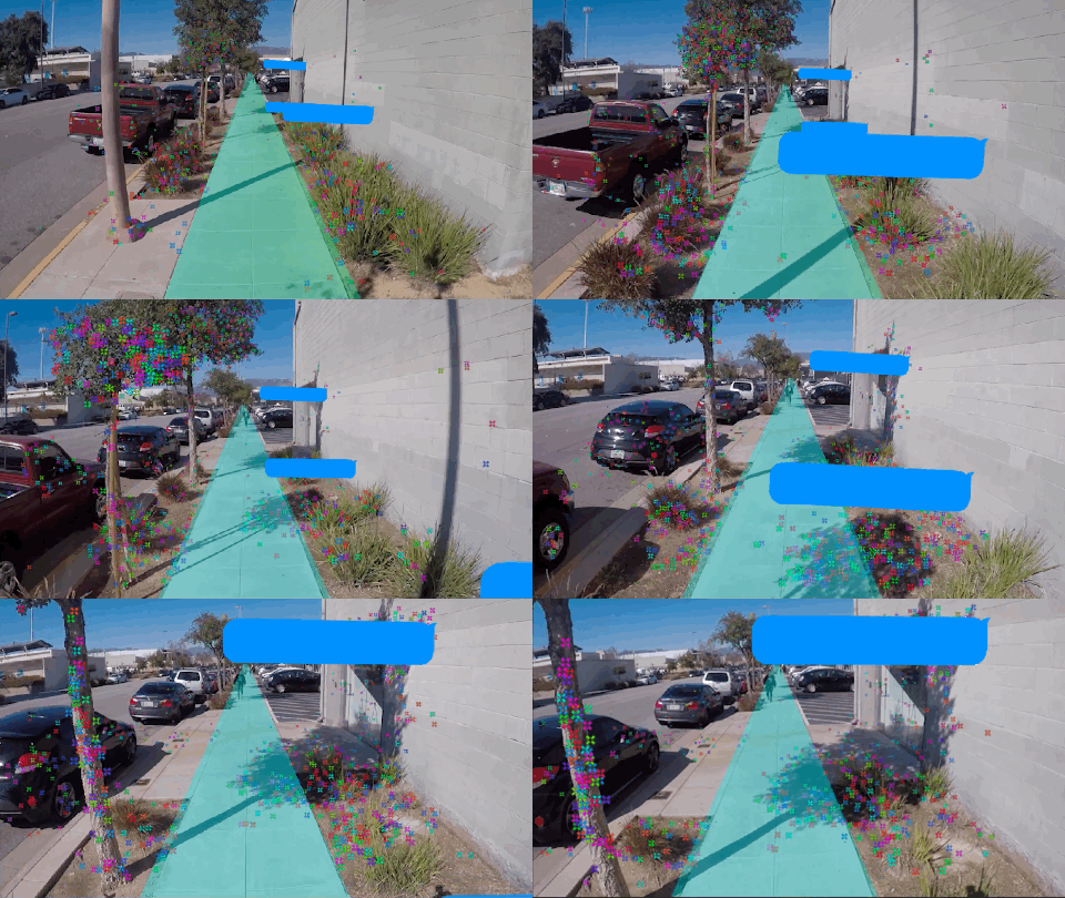
To primarily verify the idea of adaptive AR design. I use GoPro and After Effects to prototype some potential scenarios about how AR content change when user’s motions provide indications. Notice that these motions are very common in daily life and not specially adapted for AR device.
Even these short prototypes show the importance for designer of bringing and testing adaptive AR design in a real social environment. But the difficulty prompts me to look for the further idea: the tools and examples for designer in VR.
A high fidelity prototype of design tool and design guide
The scope of this project evolve from a simple visualization tool to a set of tools and examples for designer as a guide for AR design. And here are some high level guidelines:
User controls their motions for different purposes and in different places with different personalities to maintain social etiquette. So do others.
User’s motions give others expectations that how the user will use space potentially. So do others.
User’s motions can also tell the AR system the expectation that how it should adapt its content to meet social etiquette.
Current design tools and design guide don’t provide guidance for AR designer to build an adaptive AR app that meets social etiquette.
1.Tool for Designer
The tool should simplify the evaluation process. In this prototype, I use virtual reality (VR) to help AR designers explore private augmented reality (AR) interactions in public.
User can test AR app in a real-world simulated-scene by using VR headset. They can only see their AR content just like how it is in the real world. There are three different scenes in this prototype with pre-recorded mocap characters.
For designer, the designer view provides a “god view” in which designer can see everyone’s AR content in the test. Also, the designer view provides the visualization of implicit space that main user claim, indicate, own and occupy in real-time. And how their adaptive AR design performs for individuals as well as for public social etiquette.
Left: Three scenes and mocap characters with adaptive AR demo
Right: Example content layers of adaptive AR
2. Guide for Designer
Building on the concept, we can design a system for AR app to treat different implicit space in different ways:
Claim Space
User’s limb motions including hand gestures show the temporary space that they can reach further and use in public. For AR app, the display layer can adjust their layout to follow the changes of claim space. In this prototype, claim space is showed as grey cube.
Indicate Space
User’s trunk dynamic, for example, how they lean and walk toward, show the space that they are about to pass or arrive in public. For AR app, content with lower interactivity like notification can respond to this space, which provides a brief and no disturbing interaction. In this prototype, indicate space is shown as blue cube.
Occupy Space
User’s stay has the power to show their space occupation to some extent, the longer they stay the stronger their space occupation is in public. For AR app, content with higher interactivity like the function layer should stay in this space. The display layer can increase their visibility and interactivity to take full advantage of this occupation. In this prototype, indicate space is shown as blue and yellow sphere.
Own Space
User’s ownership of a space doesn’t reflect by their body motion but a consensus from common sense or regulation. Or even just a monopoly space that pre-defined by user. For AR app, it just likes how we use space for AR content today, none of the social etiquettes need to be followed. In this prototype, indicate space is shown as white dots.
Create a better visual system
After rounds of user tests, I turn the feedback into the next round of iteration. Most of the feedbacks point out two things:
1. visual effects are unclear and don’t show their unique properties of different space
2. In the future of AR era, regulation of space usage can be common which is missing in my implicit space category
In this iteration I adjust the category of the implicit space, add one more space “Define Space” to present the space that is behavior are defined by authority or convention. New logos are designed for print material and introduction video. There is also an update for the prototype with more representative visual effects and a new algorithm.
⬆︎Instruction video combine studio shooting and after effects editing.
Deliverables
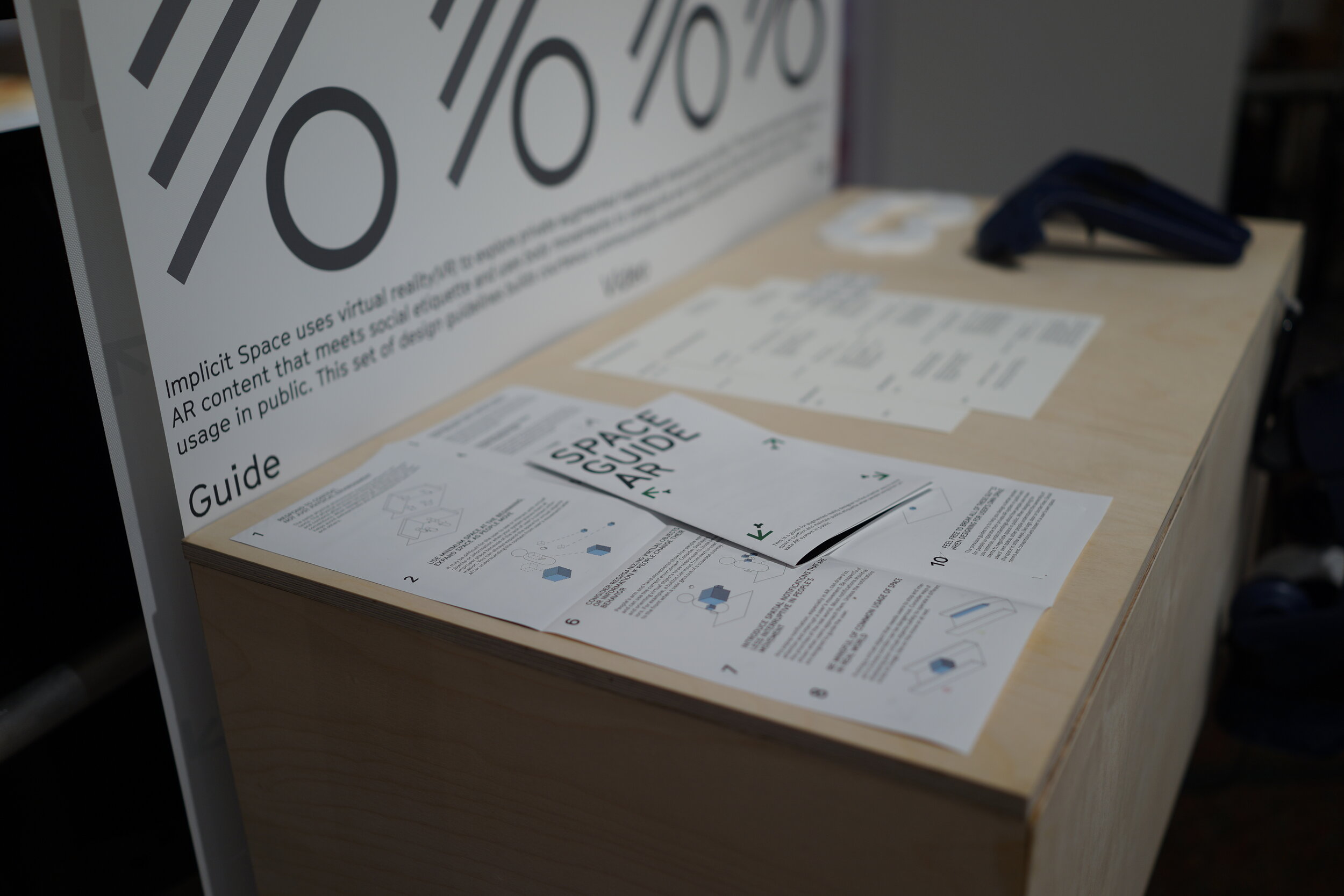
To sum up the explorations in this project in a more deliverable way, I also write a hypothetical AR design guideline for designer. This design guideline challenges the existing self-centered guideline for AR, which mostly care about the user and forget the people in public. Here is the Design Guide on Medium.
A live prototype demo was setup on Pasadena Convention Center as part of the design exhibition in 2019.4. More than 20 designers tried the system and left many provocative feedbacks.
Round up
Some questions are coming from the shadowing during the test in the exhibition. A lot of people enjoy exaggerating their behavior to create a bigger implicit space (in another world bigger space impacts) to have a bigger stage for their AR content. What is the possible reason that leads people to ignore the social etiquette to extend their space monopolies in public?Does space competition create balance? Then what is the possible balance so people are suitable to be side by side in public? The next step of this project should move from utilizing existing social etiquette as a guideline to what will be the new etiquette that creates by AR device? And how to guide people to be more courteous and respectful through augmented reality?
Spatial computing uses real-world space as their “screen”. But real-world space is a public resource for not only AR content but also physical objects as well as real people. This project assumes people will follow the rule of the real world: morality, etiquette, and social code. But still, when immersive technology needs people to occupy space that everyone shares, technology has the power to guide people to do better. Instead of learn from world, new design can guide the world. After all the process of exploring, observing, prototyping and iterating, this project trying to tell designer to consider user experience from third-person view for a bigger scope and jump out of the small scope that only comes from the user’s first-person view. In the era of immersive technology, user experience is not only for the user who uses your app but also for the people around your user.


