Design Process ————————————————————————————————————————————————————————————————————————————
Kick-off
Get to know our products
After getting started, I bought myself some time to investigate and get a better understanding of each product flows and needs as well as existing research conducted so far by having conversations with product managers.
My initial revelation was the products in the smart-life series are so different and unequal in terms of control hierarchy as well as function. Some are end devices, some are controllers and some can be both.
Complex control hierarchy within Bosch smart-life series product
The other realization I had was that our user, who is mostly 30-50 years old upper middle-class family member, either has smart-life products as a set includes speakers and KNX or only has one product like baby crib or air purifier. So it was critical we design the app for these two extremes.
*Since the former situation somehow cover the latter situation, we decide to set the former as our primary target and the latter as our secondary target
User usually has an extensive amount of products (left) or just one (right)
What we learned from user
Once I understood the product better, a series of user interviews were prepared and conducted by our user researcher Soya and me. We rotated our roles among facilitator and note-taker/observer to had a better engagement with users.
I have intentionally omitted confidential data here.
I was surprised by what we found and there are 3 insights that shaped the direction later I want to highlight here:
1. Enjoy a better home not a smarter home
For our user, “smart” is just the method to help them achieve “better”. They come to Bosch smart life products for better awareness and a sense of control of their home.
2. Only perceive end device and direct control relationship
User knows they can control the light in the room, not complex logic of our products like “actually is KNX control the light”, even they know they buy the KNX
3. Good at following but bad at exploring
Users are not tech-savvy and don’t like spend time figuring out how this “smart” system can work better for them. But they can learn from the existing setting then follow the presets
General design direction
Based on synthesized insights from users and products, I dug deeper into the framework. Normally, there are many smart home best practices in the market that share some similar design approaches. However, there was no existing framework that can be a good reference for our case, so I analyzed a lot of related products and inspected a lot of our research archive. Four key design challenges emerged:
How might we better create awareness and a sense of control for home?
How might we reduce the difficulty of understanding “smart” functions and keep them accessible?
How might we remove the complex control hierarchy of Bosch products?
How might we better adapt to the various amount of devices and future expansion?
, which later evolved into 2 key principles From smart to home and Balance between home and device.
From Smart to Home
The home-centric flow
If the new experience was to shift focus from device intelligence to overall home awareness, the user flow needs to start from home perspective and show how it was being taken care of.
The common flow that is popular in the market, we called device-centric flow, is starting by looking for adjust the device status directly and end up perceiving the changed result of the device. The earlier analysis result on the related smart home apps shows the device-centric flow:
Device-centric user flow
By contrast, home-centric flow means user start their accessing from the idea of checking or adjusting their overall home environment. The result of adjusting single devices will be reflected as part of home environment change. Therefore, users start and leave with a comprehensive sense of home environment.
Home-centric user flow
On the first try, my hypothesis was adding new home-centric flow portals to the existing structure should work in parallel with the device-centric flow if user still wants to find a specific device. So instead of designing for only one flow, I designed a flexible structure optimized for various start points. If the user wants to check then control the from home perspective, it provides a new portal. Otherwise, user can still use their familiar way to find the target device by zone. Center to the structure were these concepts:
We needed to respect the start point of accessing home summary varies from time to time. It can be by type, by scene, or by zone
The different opting out points would determine what kind of information and control the user can access
To introduce fewer new concepts, the only “smart” feature — scene control needed to be present as some kind of overview
First version information Architecture
Home overview and scene together with room(left). From home overview to overview detail(right).
Later, user testing unveiled some problems with this structure. I will explain in the following paragraphs.
Summarize home in a more intuitive way
A critical part of home awareness is that users need to know a summary of their home intuitively. The existing third-party app did not do a good job, relying mostly on showing a single device’s status.
During the previous user interviews, I observed how they describe their home environment. The diversity of room layout, the variety of the context and the difference of user’s habits meant that the summary can be richly diverse.
The most mentioned quotes when user describe their home
I started out by creating a concept model of home environment cognition with those quotes. This exercise helped me realize that the perspectives could have overlapped with each other and doesn’t necessarily be precise. For example, home environment and home air quality can be two things they care about separately, but they actually overlap with each other on both data and related devices.
I was not sure about these findings. So I run one more round of open card sorting workshop to validate, also specify what needs to be covered in summary.
I have intentionally omitted confidential data here.
The concept model
Visualize the summary
Early experiments focus on a larger vision to create a comprehensive summary that provided various descriptions in a limited space. And followed with iteration on layouts, colors, wordings, the level of detail and some interactions.
The first round of iterations focus on finding out what users are looking for
Things I learned from the first round of iteration mainly about the importance of knowing state roughly, ease of scan, and chance to check details
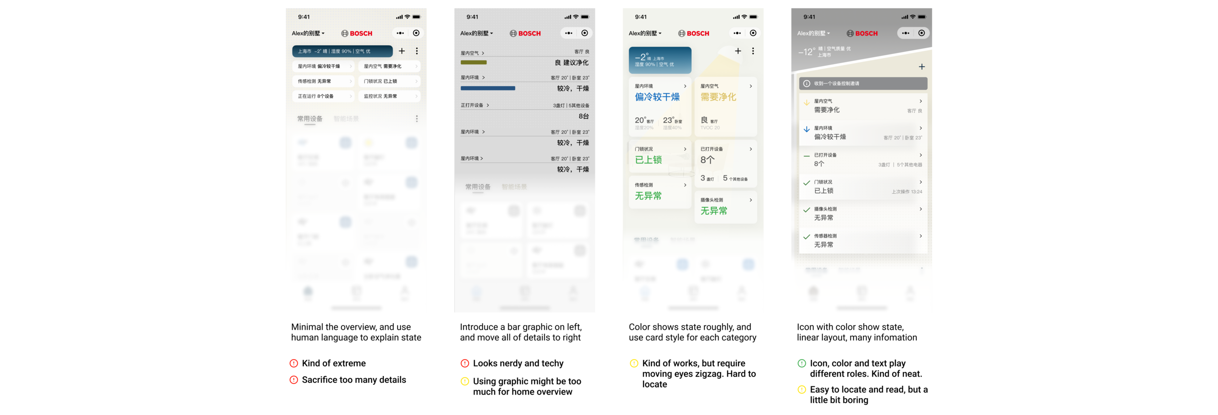
However, given the challenge of information overload we had to face in our primary situation that users may have a lot of products, I decided to experiment with a briefer version to fulfilled the needs listed above. And followed with many iterations on layouts, colors, and wordings too. I worked with research to run user testing to ensure the summary got right to the point and concise. There was one design direction emerging.
The second round of iterations try to find out a promising direction (right)
The linear layout showed the best potential and also provided good content scalability. The overall goal for the final design is to build home awareness via this summary. The following rows represent individual experiments I ran in order to validate that these design decisions can indeed help people know their home.
1. Wording for each category
Naturally, we think the humanized language is best for people to perceive. In this case, it actually makes people hard to understand what exactly it says.
After analyzing the testing result, we found people have different standards to define, for example, cold or warm. Using neutral descriptions for each category helps people quickly understand what happened.
2. Color specturm for overview
We all know some colors have specific meanings. My hypothesis was just to use those color norms for each category.
However, testing shows it was too colorful for users to quickly get the idea behind the color and hurt the readability. We tested several treatments and eventually narrowed it down to only two colors, which was enough to highlight the situation.
3. Icon for each category
The icon is powerful to show something more detailed and subtle. In this case, I only used icons to emphasize red item firstly.
After testing several treatments, I realized icons can play the role that color used to be. I built a set of icons for each category to show different states and also maintain a good readability.
Over-designing for home feeling
The goal of these designs was to highlight the environmental differences between outdoor and home. I assumed that showing a dynamic outdoor environment is a key to building the awareness of home, also users can use environment info as a reference to control their home. Our team and product owner did love this idea very much.
The dynamic outdoor environment graphic and the house shape
After testing many iterations of this experience, I repeatedly observed that:
The outdoor environment concept was mostly missed, the home overview had already drawn most of their attention.
Users had their own trusted outdoor environment info resource, and always keep in mind when controlling their home devices
Users mostly did not care about the outdoor environments in this app at all. In some designs, my effort to highlight the outdoor environment info even became a disturbance. My fear of lacking home feeling, further compounded by stakeholder feedback was being reflected in the design of adding dynamic animation to reflect the weather and highlight the sweet home. I felt like it was time to let it go.
After more rounds of testing, I killed the idea in favor of a more simplified interface and only kept minimal outdoor info in the overview.
Design iterations exploring ways to simplify and present outdoor environment
Balance between home and device
Bring the end devices to the front
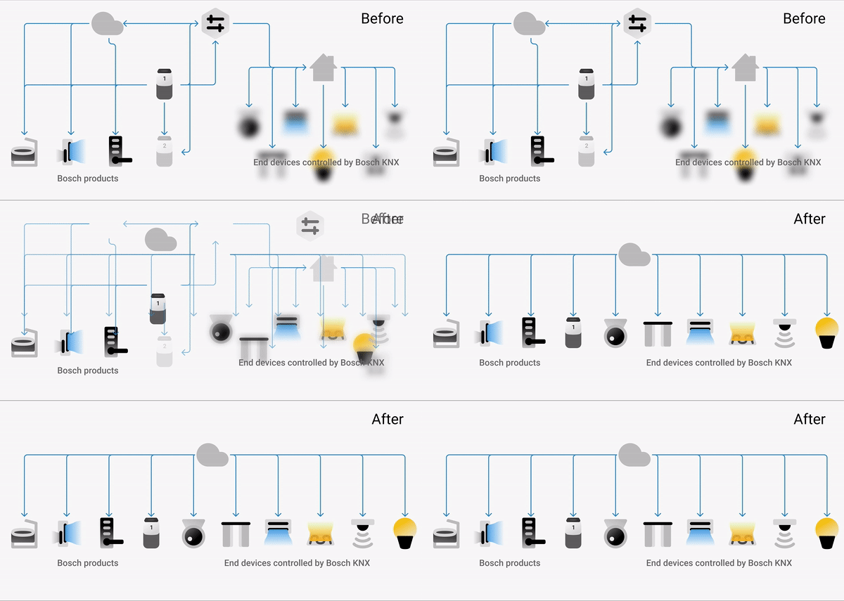
The decision of bringing the end devices to the front was brought up by questioning whether users need to know the logic behind our product.
The Baby Crib and Air Purifier are easy for users to learn and control. But the products like KNX that act as an agent to make the traditional device smarter are too hard to be understood. Not to mention the complex control hierarchy when putting all of them together.
So I proposed and worked closely with the developer to skip the hierarchy and only present the end devices on the user side. This means users can bypass the complex KNX control panel and directly control the end devices. This required a lot of efforts from the development side.
The transition from how it actually works to how people should perceive
Unified control panel
Now I need to deal with the variety of control panels for each device because many new devices had been included. The key was how to organize various data and control components in a unified layout that has good scalability.
While moving forward in the previous design process, I keep involving the product manager in the loop and went through cycles of requirements, consensus, and approvals when designing the control panel for their products. It helps me not to miss any products features. Those are vital to each product manager.
I have intentionally omitted confidential data here.
Unified layout for different data display and control requirements
Iterate on structure
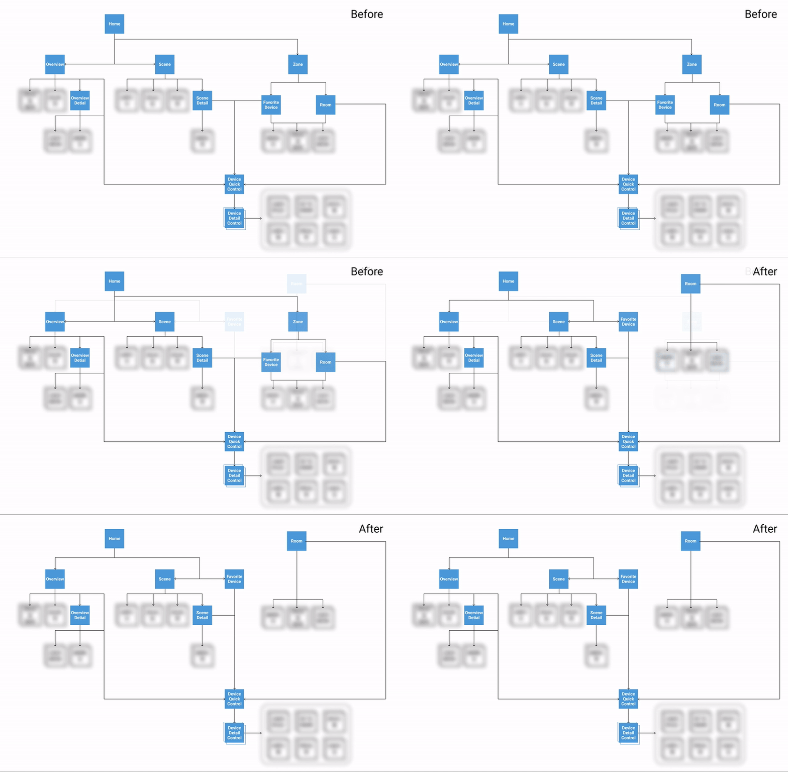
In the beginning, we organized different access points on one page to reduce the complexity of this app. This is with our assumption that a simple structure with flexible portals can reduce the chance of getting lost in the app maze. To de-risk the assumptions and test the design, me and researcher brought the prototype to the user.
The home overview design resonated well with participants, confirming part of my intuition around the home-centric flow. But some designs need evolution:
The number of rooms was able to grow up to 15 and the number of devices can be more than 50. It makes this part way too heavy on the page.
Mixing home and room made them confused about where they are.
The real-world scene switch is similar to a single switch, users perceive them as a similar thing even they confuse a lot.
I adapted with a more balanced structure with a new room tab. The new structure separates the concept of home and room and adds quick access back as well as scene control.
The previous layout draft vs updated layout
Rethink the scene and automation control
I was curious is necessary to specialize in the scene and automation control? In the real-world, our users are familiar with the physical scene button and automation switch (for example a switch to control the function of turn-on night-light if they get up at night). Our previous testing showed me how strong their comprehension of real-world buttons affects their understanding of the smart-home app.
I see the opportunity to simplify this logic, the solution is to introduce scene control and future automation control as on/off switches which is similar to the switch for device. In the room, like the bedroom, scene control is pre-configured for its most common usage as a quick action.
A common scene button in user’s house
The scene control in home tab(left, middle), the scene control in room tab(right)
Visual system
When we plan the project, I already realize this is a good chance to introduce a brand new Bosch brand image into the market. Along with the design project, I also held workshops with marketing, product owner, manager to align with potential visual directions.
The “cozy vibe of your warm home” eventually led the direction of my visual design. I cooperated with illustrator Yao to create a key illustration. From it I created a set of illustrations, visual design specs and keylines — the design system.


